


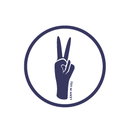


As VP of Marketing for Lean In USC, I led the rebranding campaign for our organization. We made a sharp pivot from our former brand identity of predominantly red and white, which also had a strong preference for utilizing calligraphy for typography.
Overseeing a team of two directors, I collaborated with Claire Wong (Director of Marketing), to create a new palette to better reflect our organization and the impression we wanted to give others. Red was the original colour of the host organization, but no longer reflected the community that Lean In had formed at USC. After intensive discussions with our President, we curated a palette that had warmer and softer tones, as well as refraining from utilizing pure whites and blacks for text.
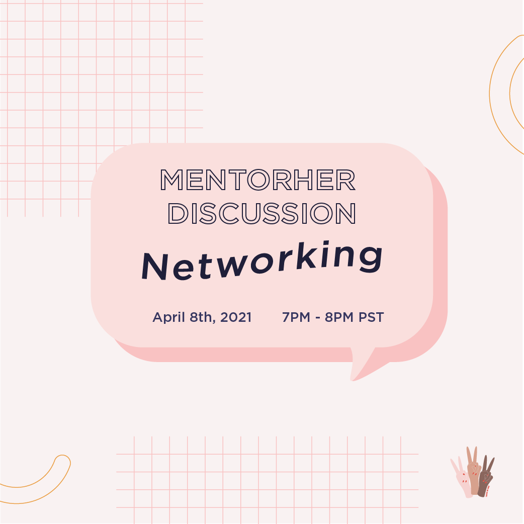
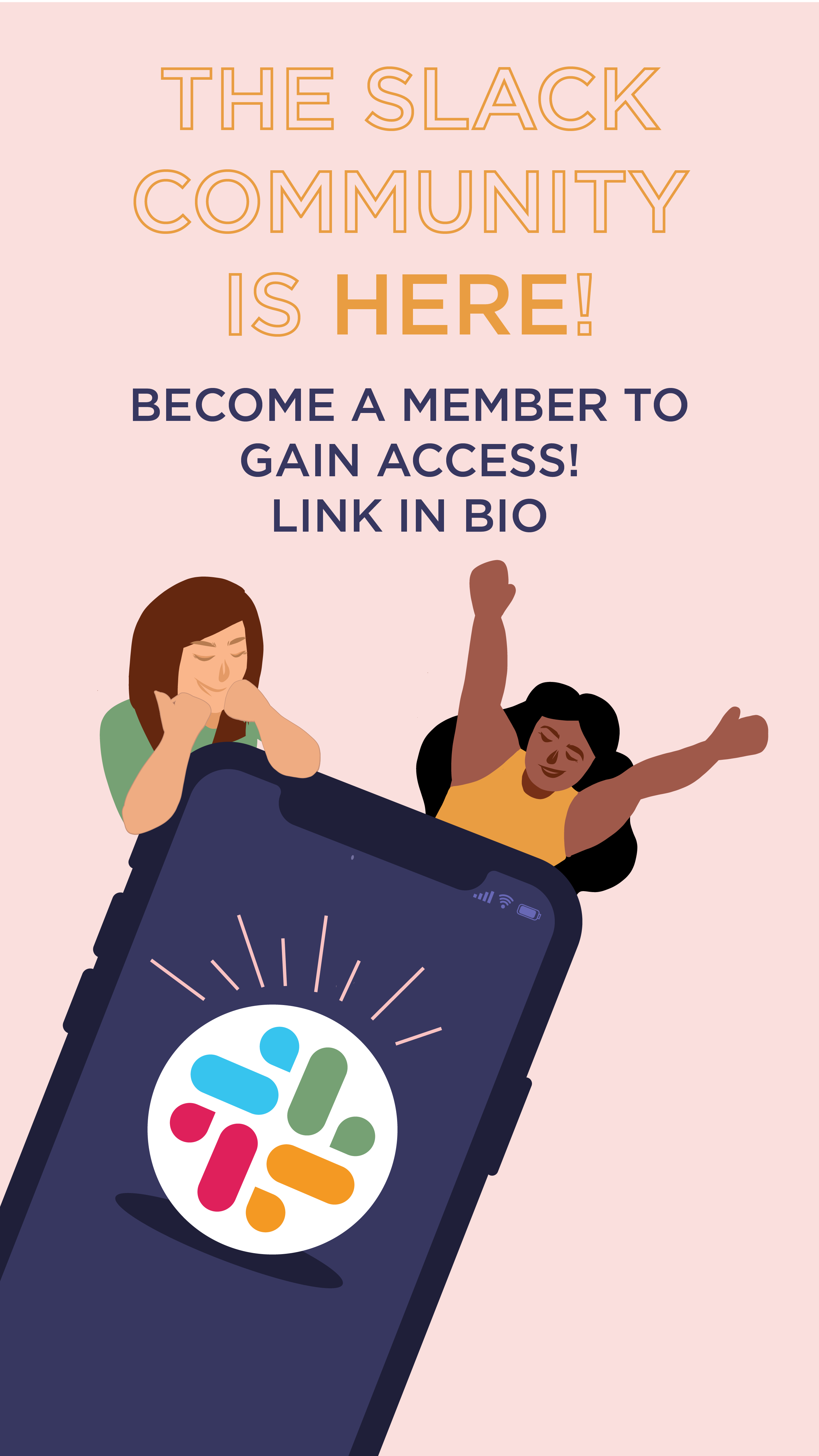
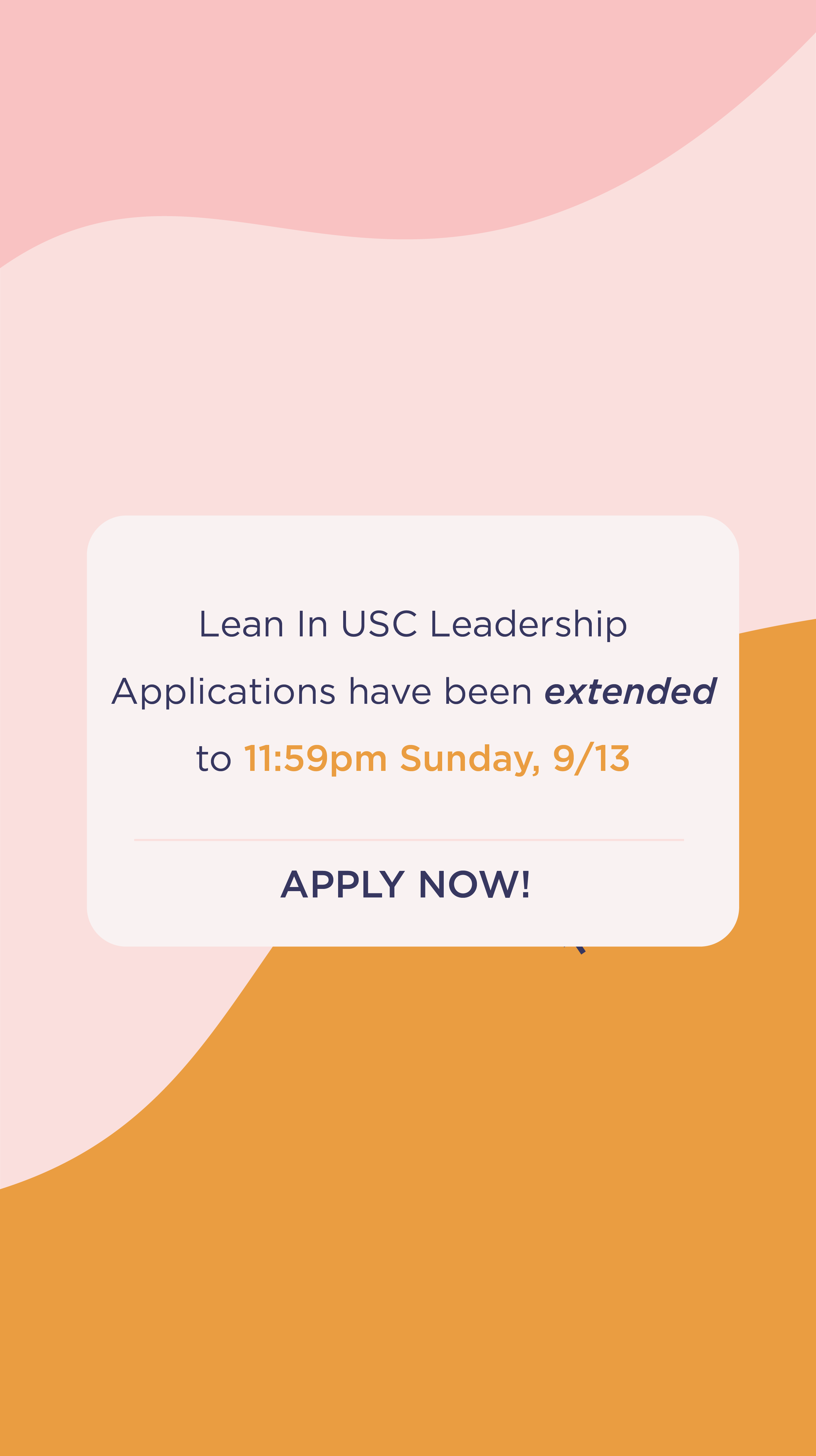
This also included selecting Gotham and Miller Display as our new fonts to give our brand a crisp, modern look, and to stay consistent. Throughout the year and a half of working on the brand, below is a selection of graphics I've created for our social media, and further below is a peek into our brand guide. The brand guide has mainly been utilized to ensure consistency amongst the team, since the Marketing team mostly creates graphics, whilst the Operations team creates the presentation decks.


Color palettes, logo, and font guides built in collaboration with Claire Wong
